01. Histography
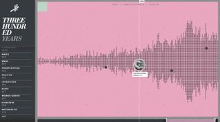
Histography is an amazing way to explore 14 billion years of stuff
If you've ever watched Cosmos, you may remember Carl Sagan talking about the Cosmic Calendar. If the age of the universe was condensed into one year, recorded human history would fit within the very last seconds of 31 December.
14 billion years of events is a huge dataset, and displaying it in a browser is no easy task. But designer and developer Matan Stauber rose to the challenge – although even he wasn't sure it would be possible: "I think the main obstacle would have to be proportions," he explains. "How do you create a timeline when 99.9 per cent of the history we know will have to be condensed into less than one pixel of the screen?"
The son of a historian, Stauber created Histography as a student at Bezalel Academy of Arts and Design, under the guidance of Ronel Mor. "If we think about ways people visualise history, timelines are probably the most common one, and yet they haven't changed a lot since the days of the printed paper," he says. "I saw that as an exciting design opportunity, especially today with the access to big data sources."
The site scans and indexes events from Wikipedia, grabs the article, and pulls in a Google image and YouTube video. The data is easily discoverable and a joy to consume. If you've ever lost hours exploring Wikipedia articles, set aside plenty of time for this one.
02. Filippo Bello

Adoratorio opted to use CSS3 and Javascript instead of WebGL to give a sense of depth
This online portfolio showcasing the talent of Italian 3D artist Filippo Bello was conceived, designed and developed internally at Adoratorio by Enea Rossi and Alessandro Rigobello. The team were given total freedom in how to design it.
The play with depth throughout the website is very effective – the images move slowly towards the viewer, creating the impression of diving into each project. This is achieved using what is called a segment effect: the background image is replicated in different boxes that move towards the viewer. The team challenged themselves by avoiding the most obvious technologies. "WebGL is not suitable for every kind of user," says Rossi, art director and co-founder. "So the main challenge of this site was to understand how to deepen the screen using CSS3 and JavaScript code-strings only."
The page transitions and the little zoom effects on the images are a nice added touch to the final result, which was – as Rossi describes it – "absolutely beyond our expectations".
03. The St. Louis Browns
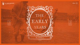
The St. Louis Browns site is styled like a vintage book
For this website about the history of the St. Louis Browns baseball team, digital agency HLK has crafted a very beautiful experience. The site reads like a well-crafted vintage book, complete with chapters and textured typography. Users can scroll through each chapter for a time-based, story-like experience.
Inspiration for the site has been pulled from 1920s manuscripts and advertisements, with many of the images directly from the years they are describing. This brings a uniquely dated feel to a modern, digital space. This is complemented by a grey-and-brown toned colour scheme, accented by a single shade of orange.
Some of my favourite parts of this site are the little details, such as the menu button (circular with a hamburger menu inside) that converts to a baseball on hover. I also love the timeline on the left-hand side, which follows the screen and updates on scroll.
The site is built using Node.js and the Express framework to allow for smooth updating and flow between content.
04. Leg Work Studio
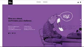
Leg Work Studio's site uses interactive animations to bring the experience to life
Leg Work does a lot of great work on the web, from graphic design to interaction and media. So it comes as no surprise to find that its own personal site is no exception. The studio's personality shines through via fun, mixed-media illustrations. It combines vintage photo effects (such as the dot grid pattern) with digitally painted white accents and scans of physical handwriting to create unique art to represent the agency.
However, it is not just the illustrations that make this website notable – the interactive animations really bring it to life. Some of the illustrations themselves are actually videos instead of static visuals, created with After Effects, and website components like the sidebar animate smoothly.
The website is designed with mobile in mind, and mobile interactions are mirrored in the desktop experience, where the user can swipe with the track pad to get through the sections. The website is built using Modernizr to ensure compatibility, and jQuery for interactions.
05. Code Conf
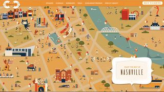
Code Conf's Nashville-themed site
The site for CodeConf really goes above and beyond the standard conference website. The conference was held in Nashville, Tennessee, and everything about this design pays homage to this location.
The website itself is nicely responsive and has a warm, cohesive colour palette. The whimsical illustrations give the site character and create a playful country-rock aesthetic that continues throughout the page (and even into the event itself).
No details are spared, as even the menu's decorative horizontal rules (only seen on smaller screen sizes) flow with the country-rock aesthetic. The site implements Google Maps for location features, and is built with jQuery and AngularJS.
Everything is illustrated: all of the venues, the 'set list' of speakers, the call to action for buying tickets, and breaks between sections. There is also a fun cast of characters that can be found dotted around the site: vector cacti, unicorns, dragons, octocats, and cowboys and girls playing music and posing playfully around the page.
06. IBM Design
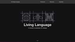
IBM Design's site is inspired by the physical world as opposed to the digital one
In the past few years, IBM has invested in growing a design programme and steering the company towards a human-centric approach to creating software. It recently came out with the IBM Design Language, which contains an update for its animation vocabulary. It provides design guidance and resources for web developers, all open-sourced on GitHub.
What I love about this animation update (even more than the fact that it's open sourced) is how the studio looks at IBM's heritage and the physical world for inspiration, instead of other digital properties. Hayley Hughes, IBM design language lead, says that the team pulled inspiration from machines; in particular their solid planes, physical mass and rigid surfaces.
"From the powerful strike of a printing arm to the smooth slide of a typewriter carriage, each movement was fit for purpose and designed with intent," she explains. "Our software demands the same attention to detail to make products feel lively and realistic."
Why is animation so critical to IBM's Design Language? "Just as a person's body language helps you read the conversation, animation relays critical information that helps users understand how to navigate and use our products," Hughes says.
07. Masi Tupungato

Image-led site for Italian wine-making project Masi Tupungato
This wonderful website from international digital creative agency AQuest for Masi Tupungato, a winemaking project based in Italy, almost lets the imagery speak for itself.
Unusually, a loading screen is used for each of the pages as the crisp fullscreen images load up. Usually this would be a big no-no – users want the content as soon as possible. However, here it actually improves the user's experience by ensuring images are fully loaded before any content is unveiled. The design creates a sense of empathy, leaving users feeling like they've been to the winery and picked the grapes themselves.
The site can be on the heavy side on some pages (ranging from 1.2MB up to 5MB in weight), which could be improved by introducing some lazy loading techniques. However, despite its weight, the site is well-built, with the start render in under one second and return visits loading within the second mark too. The framework is based on unsemantic.com, which is a successor to the 960 Grid System.
When viewing the site on desktop and larger viewports, users are able to see and interact with each of the wines separately. They can take advantage of the larger screen size to display all of the wine characteristics and details side- by-side. In contrast, on the mobile site the details and description slide in and can be slid away again smoothly.
08. tota11y
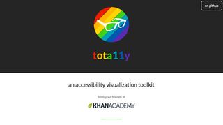
tota11y makes accessibility simpler
Making accessible websites is critically important. However, the techniques and testing involved often seem like they require deep specialisation that can make web developers and designers feel like they're adrift.
Enter tota11y: a simple tool that can be included as a JavaScript file in a page or, even more simply, used as a bookmarklet on any site. It flags items in the page that run afoul of accessibility guidelines - low visual contrast or missing textual alternatives for images, say.
Wayward elements are flagged visually, making it easy to snap a screen grab and show team members or clients exactly what the issues are, while the expanded explanations coach users on methods to quickly fix the glitches.
Khan Academy's website for tota11y is not overtly glamorous, but then, important work isn't always glitzy. The down-to-business simplicity of the text – both in appearance and in content – belies the complexity of the problem the tool itself aims to alleviate.
09. Know Lupus
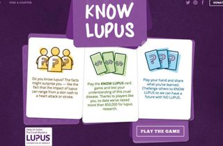
The Know Lupus site explores the condition in a fun, informative way
The Lupus Foundation of America (LFA) is a national organisation working to solve the mystery of lupus. Viget partnered with the LFA on a pro bono public awareness project to help the general public understand the disease.
"LFA wanted to create a fun yet informative game that would help educate the public in an engaging way, to help overcome that issue," explains Laura Sweltz, UX designer and project lead. "Our design process focused on accomplishing that goal, while also creating something that people with lupus would actually feel excited about sharing."
Viget's solution was a casino-inspired card game built using React, in which each card highlights a fact about lupus. Custom illustrations by designer Blair Culbreth keep the game lighthearted while addressing the serious subject matter. Casino-inspired sound effects weave through the game.
The animations are smooth and snappy, adding another layer of delight to the game. The mobile experience is just as interactive as desktop, and responsive transitions have been fully considered. The end result is a playful experience that makes learning feel effortless.
10. The Boat
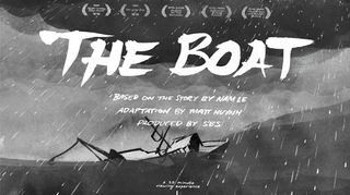
The Boat, an online graphic novel
Longform storytelling has been steadily gaining popularity on news and media sites, but broadcasting network SBS's The Boat, an online graphic novel based on a story by Nam Le, feels unique in both its style and execution. Sumi ink illustrations, expertly executed animations and a chilling soundscape capture the story of a young Vietnamese refugee's journey.
To bring the story to life, illustrator Matty Huynh spent six months with Nam Le's original prose, sketching thumbnails and iteratively creating the characters.
"I think the balance you see comes from this extended period of development," explains producer Kylie Boltin. "That deep inward-looking period enabled the core team members to know the story inside out. We knew the story beats and we knew which moments needed to be highlighted. The guiding principle was to complement the core storytelling, rather than overpower it or add an element just for the sake of it."
The graphic panels feel like diary sketches – urgent, imperfect and deeply emotional. This site proves just how powerful and engaging online storytelling can be in the right hands.
11. Run4Tiger
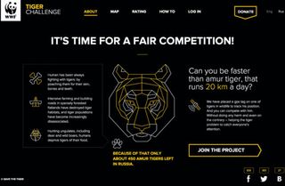
Can you run as much as a tiger? Find out with this site and your running app
Moscow-based Hungry Boys designed this show-stopping campaign site for the World Wildlife Fund Russia to raise public awareness for its Save The Tiger campaign. Why race your friends when you can race a GPS-tracked Amur tiger?
The site lets you sync your running app of choice (it currently supports nine different apps!) and pits you and other runners against the big cat, which averages 20km a day. If the tiger beats you, you donate $5 to WWF.
It's a great concept, and there's a great design to go with it. The sharp black and yellow colour palette – uncharacteristically bold for a charity app – conveys the urgency of the Save The Tiger initiative.
Run4Tiger's creator Ksenia Apresyan says the team definitely had movement in mind when designing: "We wanted to make the website as dynamic as it could be. That's why we decided to use the most fresh technologies and show our main message, made of dynamic particles, on the main page."

Tidak ada komentar:
Posting Komentar